
7/13/25


BUSINESS PODCAST ON SPOTIFY
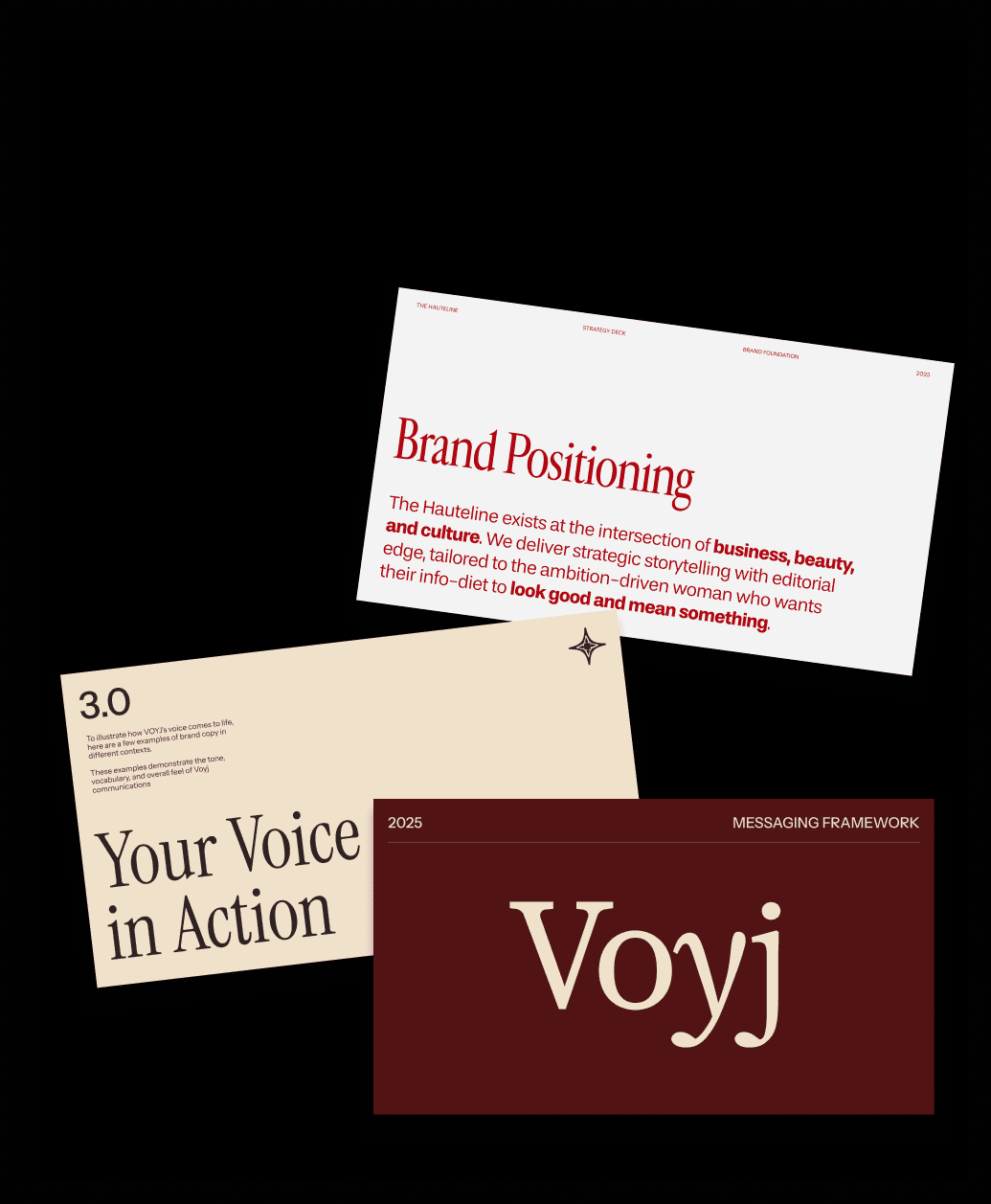
Your Brand is More than its Visuals
Early-stage brands often sprint toward a logo, a palette, and a typeface, then wonder why the market doesn’t respond. A logo is an extremely important symbol, but it is not a strategy. Visual identity works only when it expresses a clear position in the market, a promise to customers, and a personality people can actually feel. Without that foundation, even the most beautiful mark is just decoration.
The common missteps are predictable: leading with aesthetics before defining the narrative; chasing trends that age fast; treating brand as a campaign rather than a system; and assuming consistency means “use the logo everywhere” instead of “show up the same way across product, sales, support, and culture.” Another big miss is neglecting the verbal side. Without defined tone, messaging hierarchy, and story arc, your brand will look one way and sound like everyone else.
The Remedy
Strategy fixes this. It clarifies who you serve, the job you help them do, and how you’re different. From there, you can codify a verbal identity (voice, tone, naming principles, key messages) and customer-proof the experience across touchpoints. Only then should visuals come to life: a flexible design system that scales, with logo, typography, color, layout rules, motion, and imagery built to express that strategy consistently.


" height="9.98438px" id="vXP6q2Xas" transform="translate(0.28 5.016)" width="3.084116px"/><path d="M 0 1.828 C 0 2.813 0.794 3.609 1.822 3.609 C 2.804 3.609 3.598 2.813 3.598 1.828 C 3.598 0.844 2.804 0 1.822 0 C 0.794 0 0 0.844 0 1.828 Z" fill="rgb(67, 90, 18)" height="3.60938px" id="kIIx6Zl1z" width="3.59813px"/><path d="M 6.542 10.266 L 9.673 10.266 L 9.673 4.781 C 9.673 2.109 9.065 0 5.935 0 C 4.439 0 3.411 0.844 2.991 1.641 L 2.944 1.641 L 2.944 0.281 L 0 0.281 L 0 10.266 L 3.084 10.266 L 3.084 5.344 C 3.084 4.031 3.318 2.766 4.953 2.766 C 6.542 2.766 6.542 4.266 6.542 5.391 Z" fill="rgb(67, 90, 18)" height="10.26562px" id="Csy1hUzD4" transform="translate(5.327 4.734)" width="9.6729px"/></svg>)
" height="20px" id="gGb85lP1W" width="17.0833px"/></svg>)
" height="18px" id="DiwidLZGU" transform="translate(0 0)" width="18px"/></svg>)
